This article is more than two years old, the content may be outdated
Introduction
Popular products that require a a well-controlled scroll system make use of Javascript to divide the sections of the scrollable content in order to display it always in the viewport. What these products try to achieve is a paging experience. Because it is more appealing to a user to scroll like pages rather than controlling by itself the scroll. So what this means after all is: is better to make sections that list items with a controlled scroll than letting the user to scroll it.
For example: if we have a section where we display items horizontally and the scroll is not controlled then the user has to scroll by itself the whole panel, while if we have the scroll controlled the user may just swipe to left and the system will scroll for itself.
This pattern provides a better user experience and will improve the time of engagement with the users.
For many years this improvement had to be done with javascript and it had an impact in the website performance because it required a lot of calculations if we wanted to have animations in the scrolling or calculating items width to show them in the viewport without being cut.
Introducing scroll-snap property
Today we can use a CSS property called scroll-snap-type which allows us to achieve the same result that we made with javascript but with css, meaning great improvements in performance.
This feature is meant to be used in conjunction with a container and its children. Therefore, we'll have two kinds of places to use the scroll snap feature.
For the container we have the following properties:
- scroll-snap-type
- scroll-snap-stop
- scroll-snap-padding and its derivatives
For the children we have:
- scroll-snap-align
- scroll-snap-margin and its derivatives
scroll-snap-type
This property defines how snap points are enforced. Its values are: none, x, y, block, inline, both, mandatory, and proximity.
The none value will tell the container to ignore snap points. X and Y will tell the container to snap positions in their axis. Block will tell to snap in its block axis, and inline in its inline axis.
Mandatory, the container will rest on a snap point if its not scrolled. It will snap when the scroll action is finished. If content is added, resized, or removed it will be auto adjusted to maintain the resting.
Proximity, the mandatory acts like if the container has been scrolled then we have to finish that scroll action, but proximity doesn't act until the next item is near to that threshold.
Mandatory and Proximity are optional values but these are actually the key to this feature.
scroll-snap-align
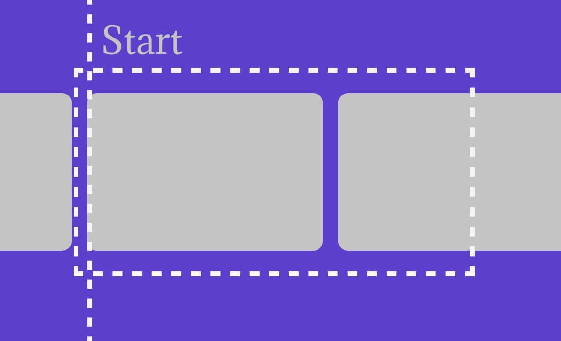
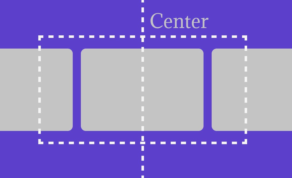
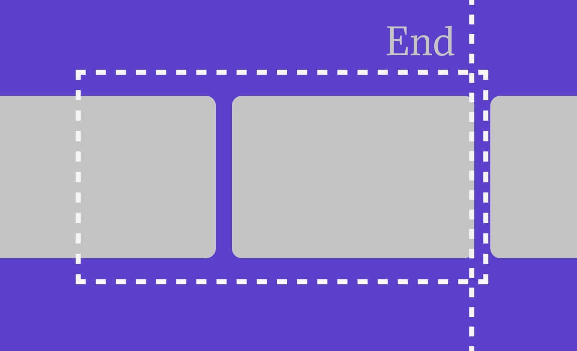
This property defines where should stop the scroll. Its values are: start, center, end. Therefore, if we set the value to start the container will leave the start of the child at the left of the container. If we have it on center the center of the child will be centered with the container, and finally the left value will leave the left side of the child at the left of the container.


Support
Can I use says that Chrome and Safari are up to date with this feature, althought Firefox, Edge and IE 11 support and older version of the spec, and you probably will have to use some tool to extend the support to the other browsers. So in order to see the demo below use Chrome or Safari, because I haven't added the older properties to the demo.
Example - Gallery
<div class="gallery">
  <div class="img">1</div>
  <div class="img">2</div>
  <div class="img">3</div>
  <div class="img">4</div>
  <div class="img">5</div>
  <div class="img">6</div>
  <div class="img">7</div>
  <div class="img">8</div>
  <div class="img">9</div>
  <div class="img">10</div>
</div>
The css is summarize, check out the pen if you want to see the whole css code.
.gallery {
  display: flex;
  flex-wrap: nowrap;
  overflow-x: hidden;
  scroll-snap-type: x mandatory;
}

.img {
  scroll-snap-align: start;
  display: flex;
  flex: 0 0 320px;
  height: 200px;
  background: rgb(100, 100, 255);
  margin-right: 1rem;
}
Result: